I decided to draw 'Elmore's Angel' because its a good, traditional drawing to practise shading, scale and detail. Its not exactly the same because I wanted to make it a bit more personal. Done on A3 with a normal drawing pencil.
Wednesday, 17 August 2011
Tuesday, 16 August 2011
Bird Photography
I looked out of the window into my back garden and there was quite a few birds eating out of the new bird seed container. I thought i'd get my camera out and take a few. It was funny how the bigger birds couldn't get any and seemed to fly away a bit pissed off!
(this one isn't quite lined up right, and it winds me up a bit haha)
Thursday, 11 August 2011
randoms of the camera
Here a selection of pictures that I took off my SLR. All different locations, with big time gaps from when I took each one. Just some of my favourites so far. With most of the pictures, such as the macro water ones, I try and focus on the colours. I like to capture life as it happens.
 |
| macro image of water flowing |
 |
| macro image of water flowing |
 |
| my nephew with his new wellies! |
 |
| seagull in blackpool |
 |
| bye bye! |
 |
| blackpool lights |
 |
| dusk at hollingworth lake |
 |
| the weather out of the window |
 |
| big hail stone! |
 |
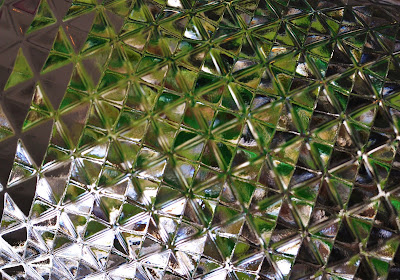
| glass of a vodka bottle |
 |
| water flowing from tap |
Deanne Cheuk
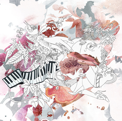
Recently I have discovered the graphics work/illustration/everything-er work of Deanne Cheuk. She uses ink in lots of her work. I'm a big fan of the good ol' ink myself. All her work seems to be beautiful and delicate. Actually love the typeface she has created. Very pretty indeed.
Saturday, 6 August 2011
30 minute drawing
So I had a bit of time to kill before I go out, so I decided to draw a bird. Its done with stick and ink, and coloured with pencil crayon for a change. Usually I use water colour for things like this or just coloured ink, but i didn't have the time. Took around 30mins.
Friday, 5 August 2011
well... :)
After ages of uploading stuff that I should of done over the past year, i'm now having a rest. I put quite a lot of work up so i'm quite proud. Up to date now, woooop!
Cussons
I think this is the project that I worked the hardest on. I enjoyed it because it was quite fun researching 'twisted fairytales' which was the theme that we had to stick by. It allowed me to use different techniques and experiement a lot with my designs. I based the products around Snow White and the Seven Deadly Sins, a different showercream to indulge in to match the sin you have picked. I wanted to portray the temptation of biting into the apple; indulging in these luxurious shower creams. The Snow White apple can also relate to the story of Adam and Eve.
I created promotional items for this project, such as A3 promotional posters, bags and t-shirts.
I created promotional items for this project, such as A3 promotional posters, bags and t-shirts.
 |
| boxnet for one shower cream |
 |
| four of the seven products |
 |
| promotional leaflet |
 |
| promotional bag and tshirt |
 |
| promotional a3/a2 poster |
Junk
For this project, we had to work in a group. We created a typeface for the 'trash talking individual,' establishing a coalition between trash- talkers and junk. We created the typeface out of junk that trash-talkers can use, whilst creating a book for them to read. We also had to present our work in a dragon's den scenario in front of a panel of designer judges. It was quite scary, but it was an experience..
 |
| promotional folders in a cardboard case |
 |
| One continuous concertina page that is in the 'junk' book. |
 |
| promotional poster |
 |
| typeface poster |
 |
| typeface poster |
Pantone: group work
video screenshots:
For this project we had to work within restrictions. We created propaganda for pantone vs cmky colour. I enjoyed this project because we worked in a group; it helped boost my confidence and social skills. We created promotional leaflets, an A1 poster and a video which was created in after effects. We then had to present our work to the year (which I hate presenting haha) and create a small exhibition.
Above: pantone work
Below: cmky resistence
Final Exhibition:
Topman
We were set a brief by a designer of the stores of Topman. I enjoyed this project because it was good to work for someone in the industry. It was quite daunting though because the competition was obviously going to be high. For my approach, I wanted to keep it bold and urban whilst incorporating the restrictions we were given. Below are the promotional items I created. I think if I managed my time more effectively, I could have been more adventurous with my designs.
SerendipiTea
This was a workshop project that I done in the second year. I had to create a teashop within certain restrictions, such as the given name 'Serendipity.' I was told that within this teashop, you are able to create your own teas. I therefore changed the name to 'SerendipiTea.' This means 'a fortunate accident,' and you can imagine that accidents could be made whilst trying to discover your perfect cup of tea. I created a menu, letterhead, business card and small promotional items for the teashop.
Subscribe to:
Comments (Atom)


