A few photographs taken in my back garden.
Saturday, 26 May 2012
Little White Lies: The Woman In Black
Front cover and spreads produced for the Little White Lies magazine.
 |
| Spread one: traditional Little White Lies patterned introductory spread with experimental typeface. |
 |
| Manipulated photographs with my own quill/ink handwriting incorporated into the spread. |
 |
| My own illustration and a very basic grid layout for the spread, incorporated with my own handwriting. I kept this spread very basic to reflect the Victorian era. |
Friday, 25 May 2012
Grimm book covers
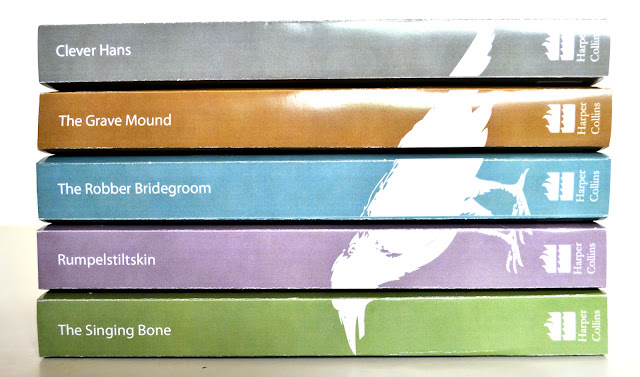
The selection of books were created for my final project of my Graphic Design course. They are aimed at adults, as the stories that I designed the book covers for are very gruesome and dark. The type and imagery are made from twigs and branches to represent the dark locations of the books, whilst the imagery reflects the gory nature of that particular book. They are kept bright so they lure the reader in when they stand on the shelf. The blurb on the back is simply a quote from the book, which makes the reader want to read more. The raven incorporated into the design represents death.
Wednesday, 16 May 2012
Grimm covers x372874
At that point when you create 50,000 versions and you can't decide which route to take. This is my latest one. It was originally a black and white photocopy which i've changed repeatedly on photoshop to look like blood- the blood is basically the shadow that has been turned from black to red on the photocopy through contrast/hue/etc
Tuesday, 15 May 2012
Super Smashing Intern Poster
So I thought I would give the poster brief a bash, because I am particularly fond of their print based design. One of their design pieces I remember, was the series of posters that were designed for the New Cartographies exhibition last year at the Corner House. I love the colours that are used and the boldness- most of my work is rather bold so I think they are a nice inspiration. Heres the poster for the brief; I aimed to keep it simple and design related, yet bold! The tool that is displayed is the 'Crystallise Tool' on Adobe Illustrator, which looks quite like a 'smash!'
Sunday, 13 May 2012
Grimm: possible finals
This is a bit of my current project, adult Grimm fairy tales. It may change yet because it isn't finished. The aim of this was to design a set of covers that are appealing, yet contain darker motives; for example, knives embedded into the delicate patterns that are featured in the story.
Concept designs/delicate booklets.
1 book jacket design.
Monday, 7 May 2012
Grimm Fairy Tales
I'm currently deciding what route to go down with my work, but this is one of my favourite pieces/development work so far. This theme aiming to make the book cover pretty/innocent from a distance but on closer look; is actually quite dark. Aiming for simplicity in this theme, one book design from a set. In this design for 'Clever Hans,' there are knives, goat skulls, needles and eye balls.
Subscribe to:
Comments (Atom)


