I was asked to create an A1 poster and A3 mini of a character/alter ego of my friend's boyfriend. I was given quite a blurred/bad light photograph so I had to improvise slightly on his facial features on my own. I am very happy because I improvised and it looks like him! I worked reasonably fast on this; it only took around 5hrs and additional tweaks after the final meet-up. I had a long time period to do this, as it is a gift for Christmas, but I was glad I worked so fast on it because it allowed me enough time to change anything she wanted to be changed. (Usually I have very poor time management!)
I created the space background on photoshop, and the character/type on illustrator. I manually shaded the character and the planets, and created the detailed stars by inverting an image of tv static. In some aspects, I would have had the character in complete colour and changed the title/star effects- but I worked with what my friend wanted and I am pleased with the final outcome.
The below image is a screenshot, because the original file size is huge and wouldn't upload!
The only thing that I would still like to change, is the yellow stroke width, but my friend was happy with it.
Sunday, 11 December 2011
Friday, 25 November 2011
Wednesday, 16 November 2011
BirdFeed
One page of my social network, which is based upon birds at a migration hotspot called Portland Bill in Dorset. This needs some refining/a bit of tweaking before the pinup. Never realised how complicated this would be with the bloody grids! D: All experience though. Still quite a bit to do yet, i'm pushing my luck with the deadline! It might be too small below, but you get the just of my idea. Hopefully lol. The buttons on the left hand side are audio, nesting, check in, mail, search (bird), bird profile/facts. I could technically make this because i've done IT, but I don't have the database program/microsoft excel to do it and make it work (though it won't be a webpage.) Nay mind though. I don't even think I could remember the codes! I'm thinking I might make the main 'tweeting' type bigger? Needs more work haha.
Friday, 11 November 2011
Strange
Some inverted photos... quite like them because they look bizarre and mysterious. First: hailstone. Second: you guessed it, a Christmas tree.
MMU Racing
Competition to design a logo for the Formula Student MMU Racing Team. As long as you put in 'MMU Racing' you could do what you want. I am not a particular fan of sporty things so it was a double challenge really. The one at the bottom with the MMU logo was my original submitted logo; in their reply however they said do some more, so I done more 'sporty' ones. You can submit as many as you like after all. Anyone from any course can enter. I never really do logos so I had a bash at it- why not? Something different eh. Gives me a bit of a break from current work. Nice change!
Wednesday, 9 November 2011
dog
Tuesday, 8 November 2011
Another font...
Think i'm getting a bit carried away. I've gave this an adventurous name, 'Catherine Points' haha. Again, a working ttf file.
Font
I made my own font whilst I was bored. Actual working ttf file! Never done one before. I decided to do simple block writing because I always end up drawing this anyway and I have done for years. Why not create a font?! Very easy program. One thing I forgot to do... is £ haha. Until I correct this, all my currency shall be in dollars!
Sunday, 30 October 2011
My nephew Ben :)
Just a bit of boredom ps/illustrator. Glorified doodle as I say. Its not perfect, but its not supposed to be because it was a boredom doodle.
Friday, 28 October 2011
Wednesday, 26 October 2011
ground control to major tom...
my spacey background in progress. actually really easy to do! haven't finished it though, but getting there. eh hey! :) i had to print screen it because the file is too big for a blog, hopefully it will look ok quality.
Sunday, 23 October 2011
A sneaky peek!
I've been asked to do a A2 poster for a Christmas present. Heres the character 'Radiator' which is going to be on front of a comic I have asked to be designed. Nice to have a little payday coming up! Done on illustrator/shading on photoshop.
Heres the shaded layer, thought i'd upload this too!
Tuesday, 11 October 2011
Bang preview
The project my year is working on at the moment is called 'bang!' One direction I have taken is to create a series of book covers, which are of animal constellations in space. During my development, I done light photography which originally represented supernovas; I have incorporated them into the book covers and placed the actual constellation pattern over the animal. This cover is the 'Taurus' constellation. I wanted to make the covers as bright as possible, representing the explosions of supernovas and the brightness of the stars.
Sunday, 25 September 2011
oogabooga!!!
I caught this beast in my house with a jug :S Had to take a couple of pictures with my SLR! Good job i'm not afraid of them.
Thursday, 15 September 2011
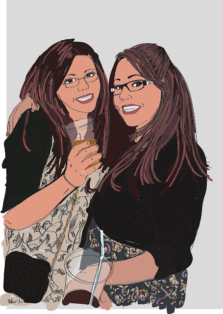
Me and Kayleigh
I decided to do a picture of me and my sister Kayleigh on Illustrator. Its not the neatest, its not intended to be neat. Just having a doodle to cure my borderline hangover! The colourings a bit weird, but the original photo that I drawn from was very dark.
Tuesday, 13 September 2011
Last Night...
...I watched Embarrasing Bodies and I got a bit annoyed with someone who was complaining about their teeth being rotton. They said they never took care of their teeth and all that did was drink litres of sugary pop and eat cake. I could understand if they complain that they have bad teeth when they take good care of them. Heres the lesson: don't brush your teeth = bad teeth. Tonight whilst i've been rather bored, I created a (graphical rant) poster basically telling people to brush their teeth.
Summer Project 11
The 'teaser' A3 poster. Quite early yet, may change. Basically, its physical vs virtual actions recorded. The final outcome/other posters etc contain the more detailed results of the summer.
I used a 'sky' background as to relate to the weather that we expect over summer, and how 'summer' has actually turned into cloudy and boring. The circular design- relating to the hours that have passed by doing these activities throughout the summer.
I used a 'sky' background as to relate to the weather that we expect over summer, and how 'summer' has actually turned into cloudy and boring. The circular design- relating to the hours that have passed by doing these activities throughout the summer.
Rick's Birthday Card
Its Ricks birthday on Saturday so i've made him a card from the family. The reason he is a smurf is because he's absolutly addicted to a smurf farm game on the ipad. (So is my sister.) The story behind the smurfberries and the price sign, is that one night he accidently bought £120 worth of smurfberries... real money :S Luckily it hasn't come through on his itunes account. Yet... lol.
Its going to be printed on nice card.When its printed, i'm going to trim it down , so ignore them two rogue smurfberries popping out of the frame :) Though the face could be neater, its the best I can do without photoshop lol.
Wednesday, 17 August 2011
Drawing Practise
I decided to draw 'Elmore's Angel' because its a good, traditional drawing to practise shading, scale and detail. Its not exactly the same because I wanted to make it a bit more personal. Done on A3 with a normal drawing pencil.
Tuesday, 16 August 2011
Bird Photography
I looked out of the window into my back garden and there was quite a few birds eating out of the new bird seed container. I thought i'd get my camera out and take a few. It was funny how the bigger birds couldn't get any and seemed to fly away a bit pissed off!
(this one isn't quite lined up right, and it winds me up a bit haha)
Thursday, 11 August 2011
randoms of the camera
Here a selection of pictures that I took off my SLR. All different locations, with big time gaps from when I took each one. Just some of my favourites so far. With most of the pictures, such as the macro water ones, I try and focus on the colours. I like to capture life as it happens.
 |
| macro image of water flowing |
 |
| macro image of water flowing |
 |
| my nephew with his new wellies! |
 |
| seagull in blackpool |
 |
| bye bye! |
 |
| blackpool lights |
 |
| dusk at hollingworth lake |
 |
| the weather out of the window |
 |
| big hail stone! |
 |
| glass of a vodka bottle |
 |
| water flowing from tap |
Deanne Cheuk
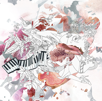
Recently I have discovered the graphics work/illustration/everything-er work of Deanne Cheuk. She uses ink in lots of her work. I'm a big fan of the good ol' ink myself. All her work seems to be beautiful and delicate. Actually love the typeface she has created. Very pretty indeed.
Subscribe to:
Comments (Atom)


